Building Share of Mind with Infographics
05 September 2022
Team Purple Iris
Show, don’t tell. It is a technique that writers employ in storytelling for an immersive reading experience. B2B communicators have extended the principle to let visuals convey a story rather than tell it through text. In other words, show what you have to say pictorially in the form of infographics.
With over 65 percent of the human population being visual learners, it is not hard to appreciate the interest in a pictorial depiction of information.
Although infographics have been around for decades, the relevance and efficacy of this content form have grown stronger in recent times. Whether you are at work or home, looking at your social media feed or reading an article online, you are constantly being bombarded with messages.
So, what does your brilliant brain do? It filters out most of the information and retains only what it finds useful or appealing.
This is of course bad news for marketers and communicators. They face an increasingly daunting task of getting the word across to their audience. With infographics, they have an opportunity to package the message well, and thus attract and retain attention.
B2B marketers are constantly looking to bring more variety in content types and infographics can be an exciting addition to your owned media content.
Here is our previous blog post, Expand Your Content Universe: Invest in Earned, Owned, Paid Media
Infographics 101 – Why Must You Use it?
As the name suggests, an infographic is a graphical representation of information. While a poster conveys information visually, infographics pack in both data and text to weave a story together and help the reader with quick takeaways.
Infographics are great when it comes to breaking down complex information into easily consumable bites. They come in an arresting format and are great for sharing on social media.
Science tells us that with the majority of our population, if a message is presented to them visually, it has a much higher chance of being remembered. In fact, according to Dr. John Medina in his book, Brain Rules, “If you hear a message, three days later you might remember 10 percent of it. But add a visual and you will remember 65 percent of it.”
Here are three instances when an infographic improves retention and elevates the experience for a reader:
- There is a lot of data to consume: Highlight the key data points, and compare and contrast for ease of understanding. Research and analyst firms routinely use infographics to highlight the salient points of a survey, instantly getting the core messages across.
- There are complex steps to be explained: Detail the steps along with accompanying text to capture the essence.
- Text-heavy content that is not good for social sharing: Pick a few key points from the content and convert it into an attractive social media asset.
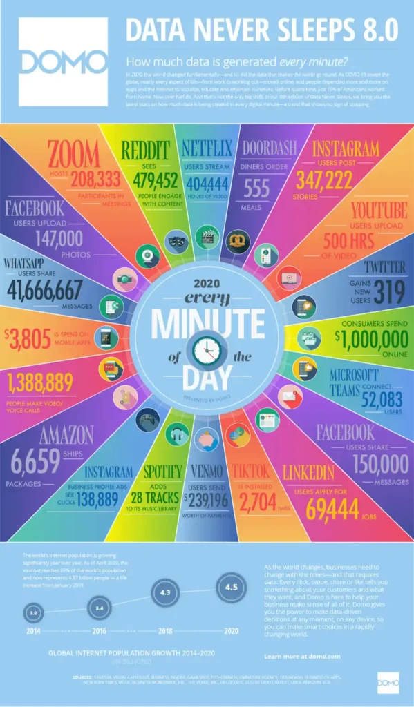
Below is an example of an infographic that has been extensively shared on social media and fits all these criteria. Loads of data is packed into an attractive template in a way that allows the reader to instantly compare and contrast, and get an impression of the way data is generated. This is the creator Domo’s eight edition of Data Never Sleeps.
Check out our other blog post on Social Media Content: 4 Examples of Great Campaigns
Evolution of Infographics
But infographics are not a new tool invented by today’s marketers. There are many examples of graphical representation of information throughout history. The hunting scenes and etchings done on cave walls and rocks that date as far back as 37000 BC are nothing but infographics. Maps, with their icons and symbols, can also be viewed as historical infographics.
Here are a few fascinating examples of some of the earliest infographics recorded:
- As early as in 1764, British scientist Joseph Priestley created what is probably the first timeline infographics called the ‘Chart of Biography.’ He plotted around 2,000 historical personalities from 1200 BC to 1800 AD.

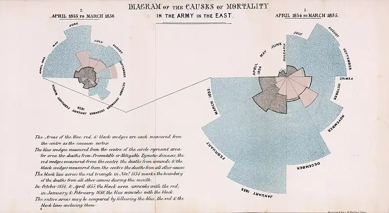
- In 1857, celebrated English nurse Florence Nightingale used a bar and pie chart to create a coxcomb chart. A coxcomb chart is like a pie chart but uses variable radii and angles. She wanted to represent the data in a more appealing manner to convince Queen Victoria to better equip military hospitals.
- In 1982, Edward Tufte, a professor at Princeton University in the US, published a book, The Visual Display of Quantitative Information. That book is believed to have opened the use of infographics to the world. He is considered the ‘father of data visualisation’.
The rapid growth of the internet in the 2000s further accelerated the acceptance and use of this content tool. People now had easy access to streams of information and began to appreciate crisp, concise infographics to obtain the information they wanted. The explosion of social media only served to exacerbate this flood of information and heighten the effectiveness of an infographic.
Making an Effective Infographic
Creating an infographic needs two important skills – storytelling and visualisation. The storyteller sifts through mounds of data to turn it into patterns or flows, or breaks down complex ideas into simpler and easily digestible facts and figures. The data and facts then fit into a storyboard before it goes to a visual artist or a graphic designer. The designer lays out the text with accompanying graphics to convey the story pictorially.
Let us look the important aspects that the storyteller, who in most cases is a content writer, and the designer, must keep in mind when creating an infographic.
- One central idea: Use one idea that is immediately obvious to the reader.
- Takeaways: Use short and simple statements in the form of captions to accompany the graphics.
- The visual element: The visuals must aid the storytelling and not detract or distract.
- Consistent style: Let your branding shine through with the colours and fonts you use. Stick to a colour palette that goes with your branding, so a viewer can immediately associate the infographic with your brand, just from the look and treatment.
- Caution against data distortion: In your bid to tell a story, do not force fit the data. The data or facts come first and then the story, and not the other way around.
- Company details: The reach of your infographic may be wider than you imagine. So do not miss out on an opportunity to be discovered by those beyond your immediate circle on social media. Add your website link for more information.
An infographic is a versatile, clutter-cutting and highly effective way to get a message across to your audience.
Finding it difficult to share on social media the great case studies you have written? Create an infographic that picks the key elements and use that shareable asset to generate traffic to your case studies section on the website. Want to create visual breaks and enhance the reader experience of your white paper? The smart use of infographics will do the trick.
Use this powerful tool innovatively to add oomph to your content and make it more consumable, persuasive and shareable.
Want to know more about how we can partner with you? Drop us an email at info@purpleiriscomms.com